REVAMPING A MEDICAL CLINIC’S ONLINE PRESENCE
Nutra Nourish is a Functional Medicine Clinic with the aim of making the world a healthier and happier place through a personalised, holistic and scientific approach to health. To do this, they needed to revitalise and modernise their old website to reach a bigger audience.


REJUVENATING AN OLD WEBSITE
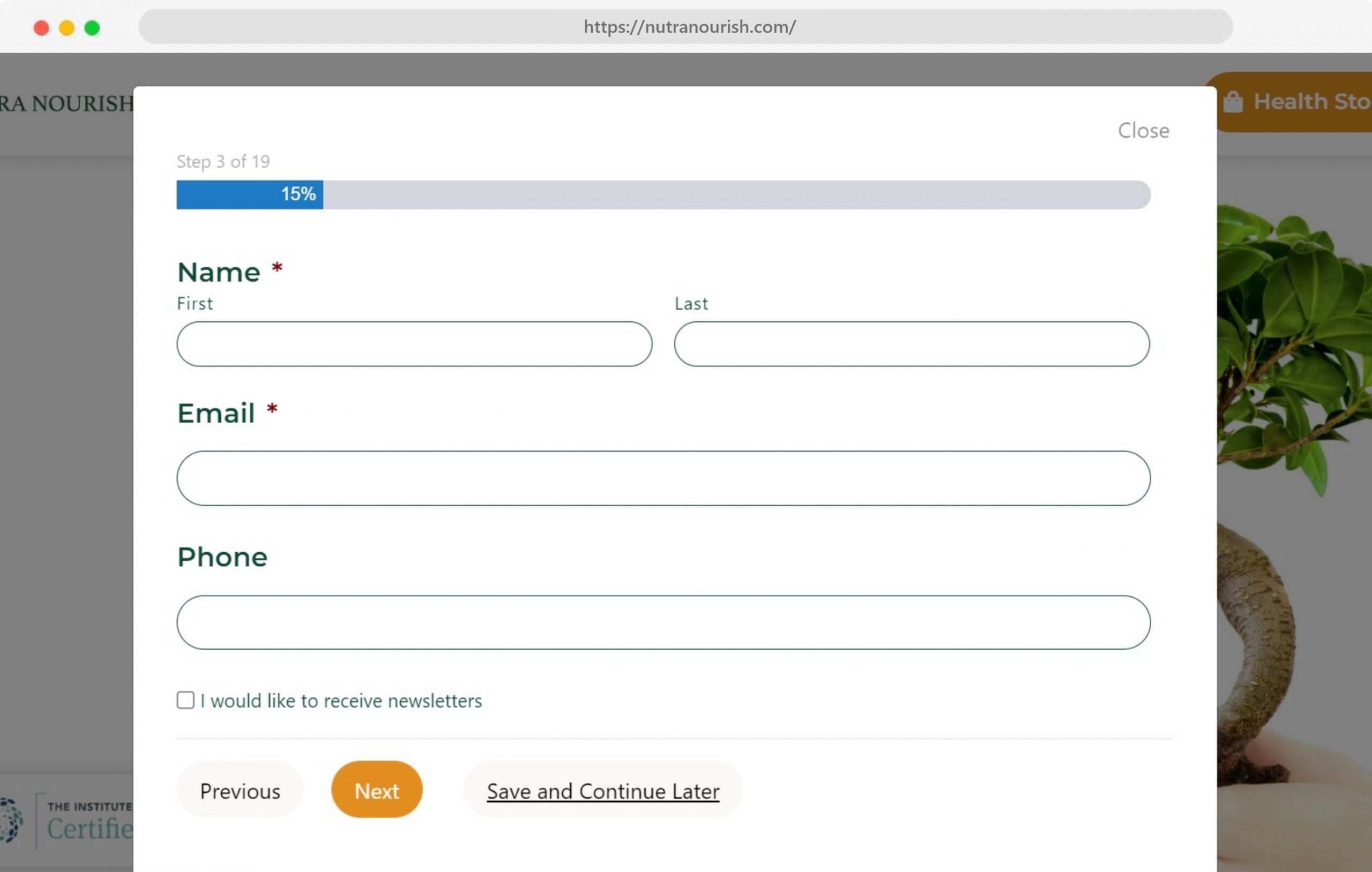
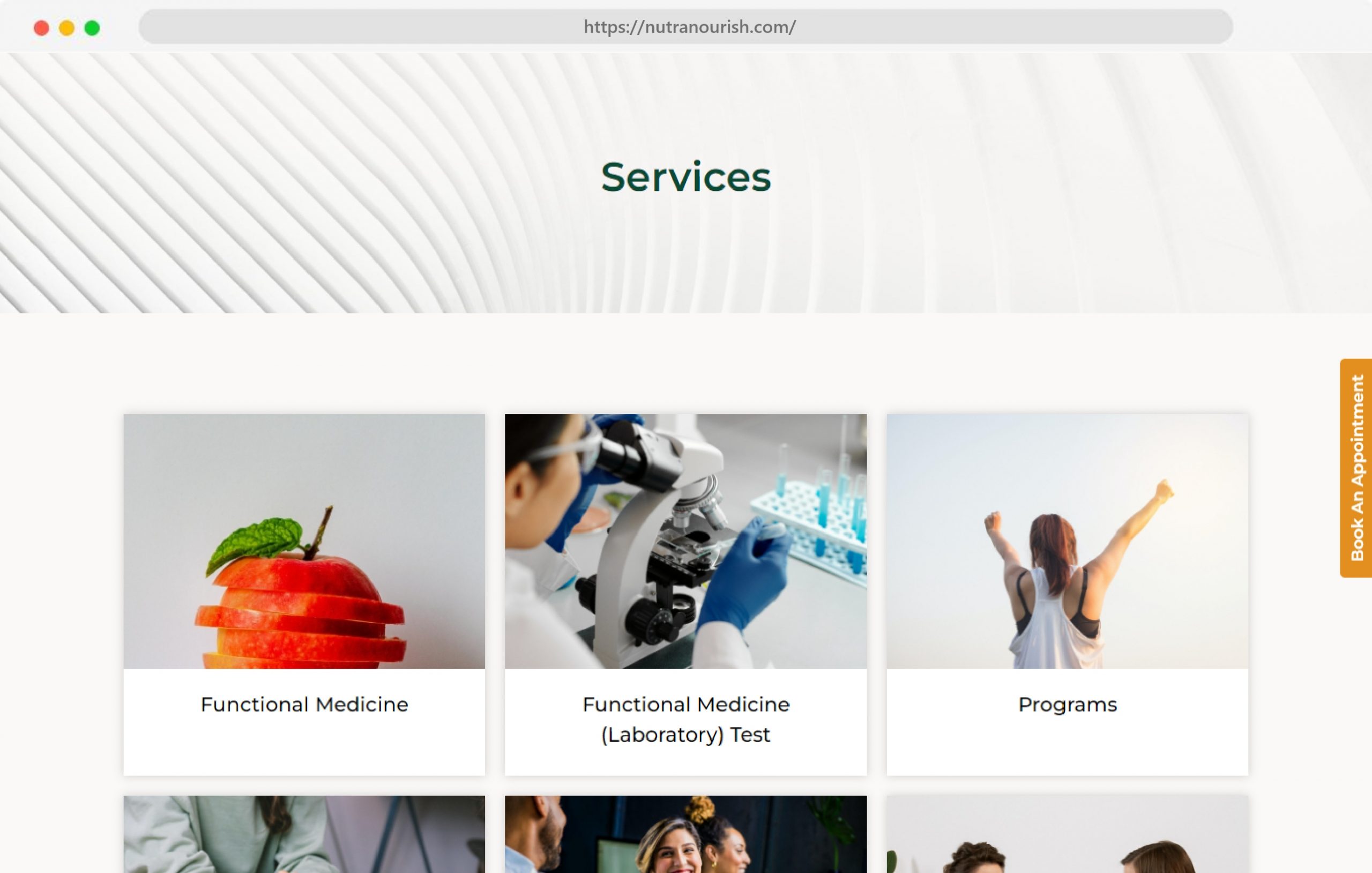
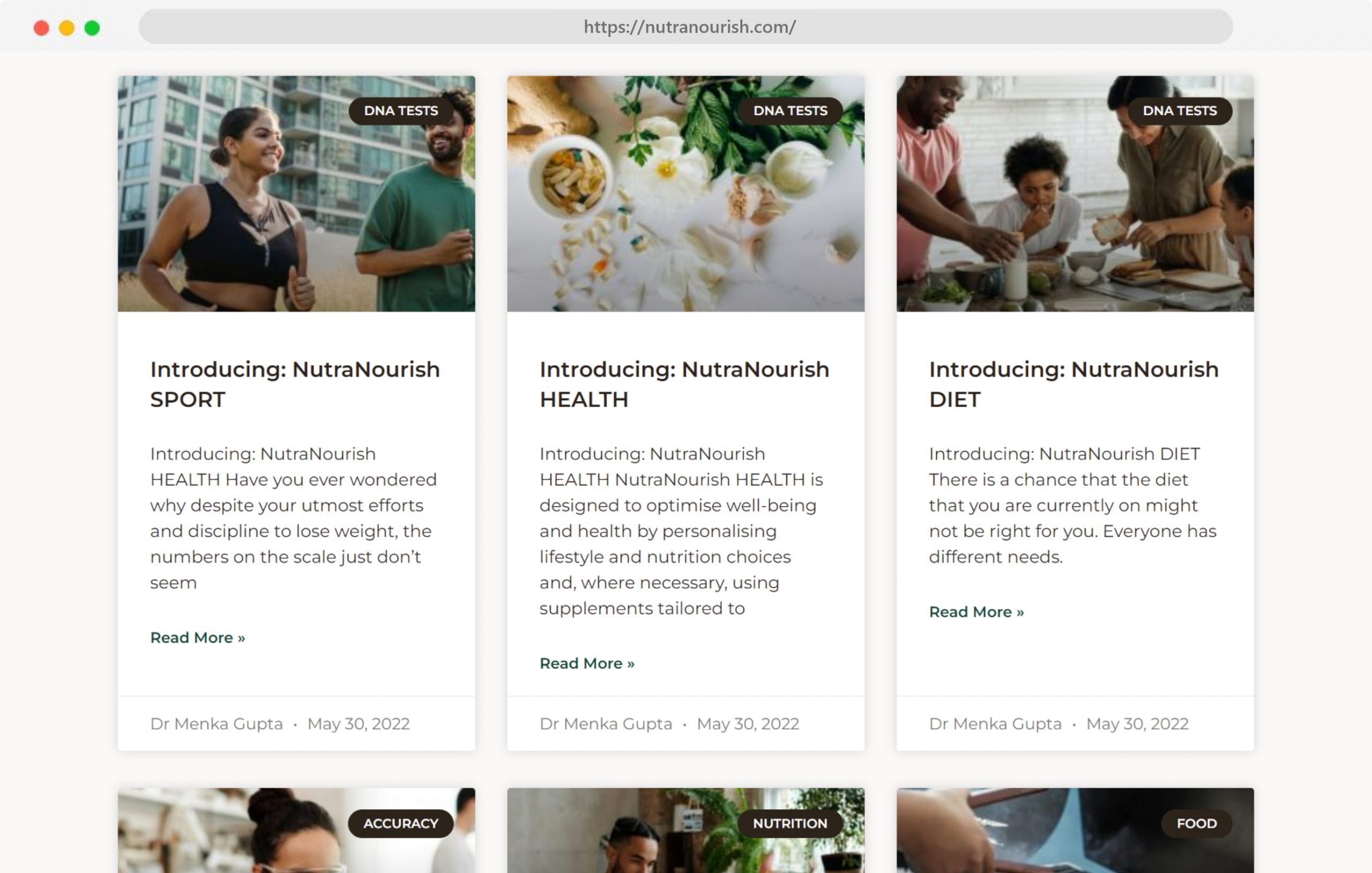
Nutra Nourish wanted to showcase its brand positioning within the healthcare industry and educate its viewers about how they are revolutionising their approach to living a better life. To start off, a total redesign was done to fit the new logo, colours and branding. A website is an online extension of the company, thus we designed it to exude tones of approachability, friendliness, professionalism and experience.

QUALITY ASSURANCE AND SEO
Migrating a website can seem nerve-wrecking, but with the proper inclusion of existing SEO meta data and keywords, we can get your website’s ranks back to where it was. Additionally, our rigorous Quality Assurance process is checked against a range of browsers and devices to make sure that the website looks good overall.

We’re really into interactivity
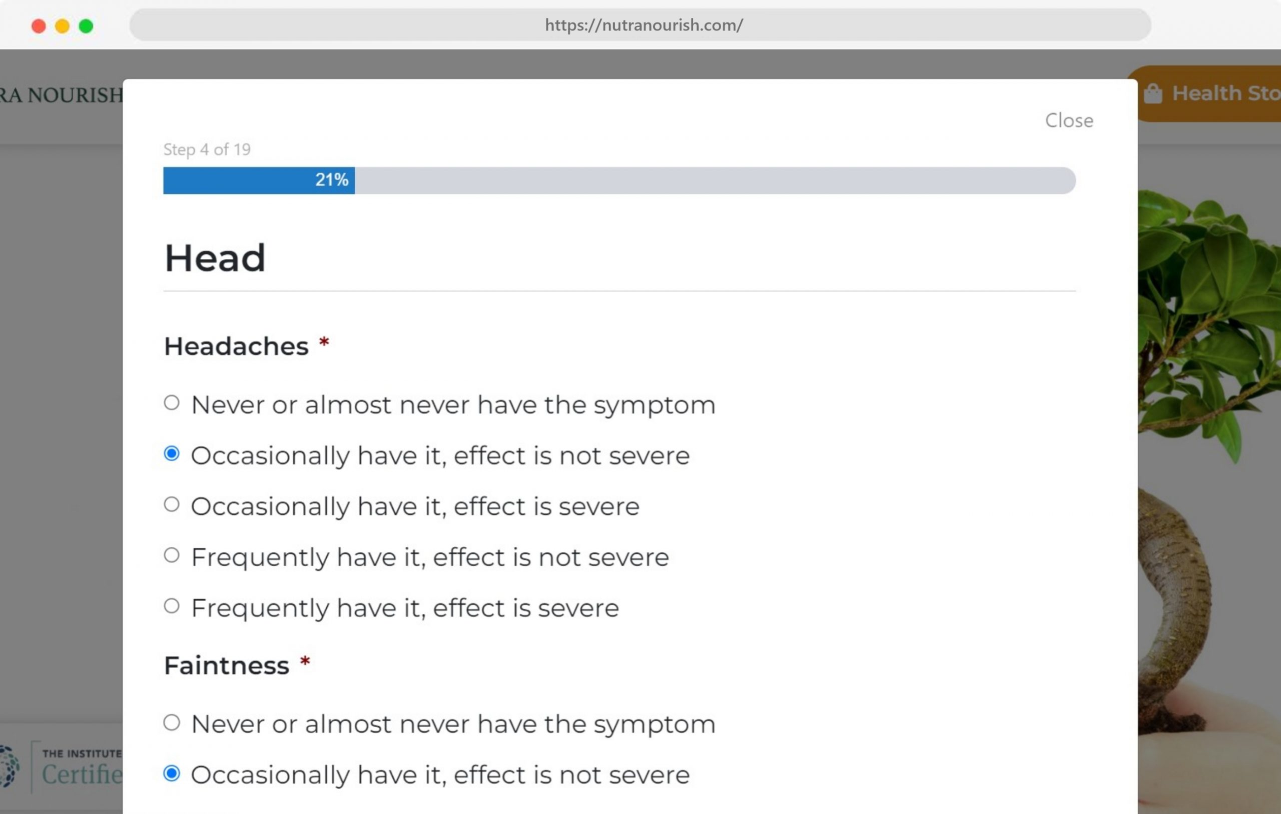
Quizzes, animated elements, scrolling effects — we can do it all!


