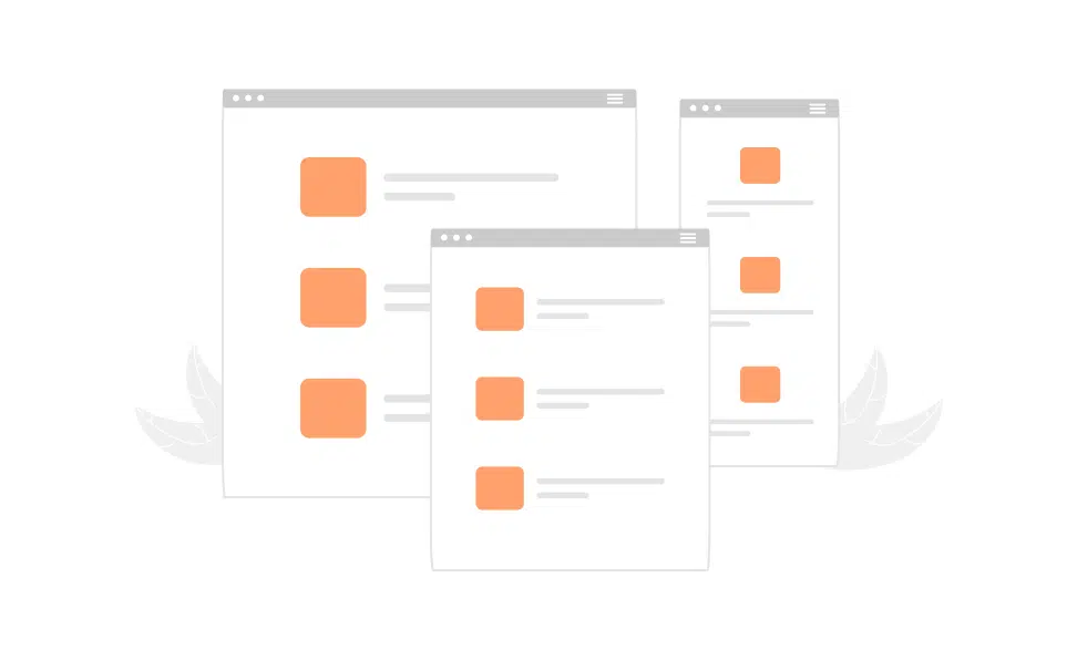
Mock-ups are the cornerstone of any successful web development project. Choosing the right mock-up size is crucial in ensuring that the final product looks polished and functions seamlessly across various devices. In this blog post, we’ll delve into the most common mock-up sizes that design agencies prefer to use for web development.
Widescreen Mock-Ups (1920×1080):
The widescreen mock-up size is 1920 pixels in width and 1080 pixels in height. This size mirrors the resolution of a full HD display, which is the most prevalent screen size for desktop computers. Designing at this size provides a solid foundation for the desktop version of a website and ensures that content is displayed clearly without needing excessive scrolling
Mobile Mock-Ups (375×812 or 414×896):
With the ubiquity of smartphones, creating mobile-friendly mock-ups is essential. Two common mobile mock-up sizes are 375×812 pixels (iPhone X portrait) and 414×896 pixels (iPhone XR portrait). These dimensions cater to the majority of modern smartphones and allow designers to focus on optimizing the user experience for smaller screens.
Tablet Mock-Ups (768×1024):
A popular size for tablet mock-ups is 768 pixels in width and 1024 pixels in height. This size is suitable for both portrait and landscape orientations, ensuring that the website adapts seamlessly to various tablet devices.
Laptop Mock-Ups (1366×768):
Laptop screens have become increasingly common for browsing. Design agencies often create mock-ups with a width of 1366 pixels, which caters to the most prevalent laptop screen resolution. This size strikes a balance between widescreen and mobile, allowing for a comfortable viewing experience on laptops.
Custom Mock-Up Sizes:
In some cases, design agencies may need to create custom mock-up sizes to address unique project requirements. This could be for specialized displays, kiosks, or other non-standard viewing environments. Custom mock-up sizes allow for tailored solutions that meet the client’s specific needs.

Conclusion:
Choosing the right mock-up size is a critical step in the web development process. Design agencies must consider the target audience, device preferences, and project requirements when selecting mock-up sizes. By incorporating a range of standard sizes and responsive design principles, agencies can ensure that their websites deliver an exceptional user experience across all devices.
In the dynamic landscape of web development, flexibility and adaptability are key. While these common mock-up sizes serve as a solid foundation, design agencies should always be prepared to customize their approach to meet the unique demands of each project.
Interested in bringing your website to life?
Don’t hesitate to contact us with any questions or concerns – our dedicated team is here to assist you! For a glimpse of our extensive portfolio, explore our works, where we showcase a wide range of impressive designs.

