REFRESHING A CHARITY’S WEBSITE STRUCTURE
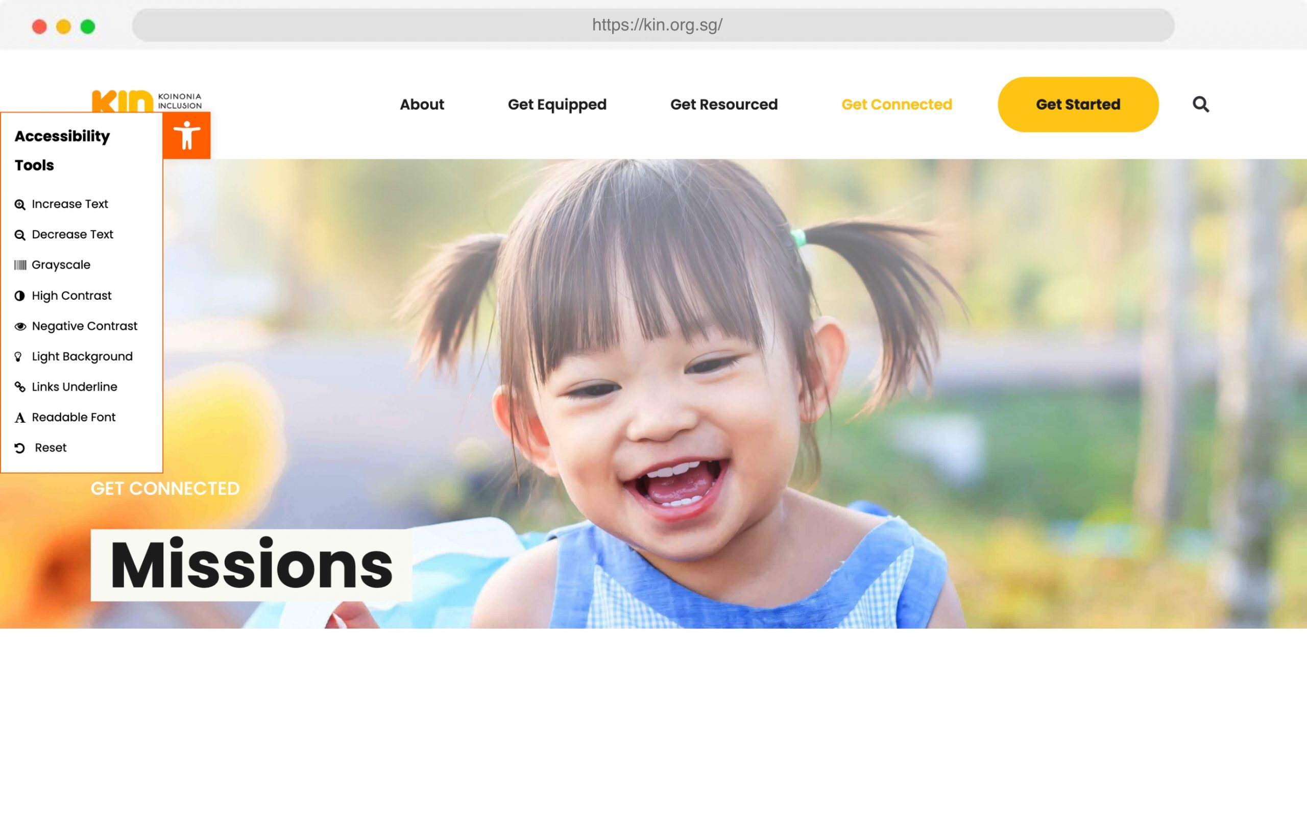
Kiononia Network Inclusion (KIN) is a parachurch organisation and registered charity that partners with churches to enable them to include people with disabilities. With their multitude of reading materials and services for visitors to look through, they needed to better organise their website structure and appeal to the right audiences.

CREATING A BETTER WEBSITE SITEMAP FOR EASE OF DIGITAL READABILITY
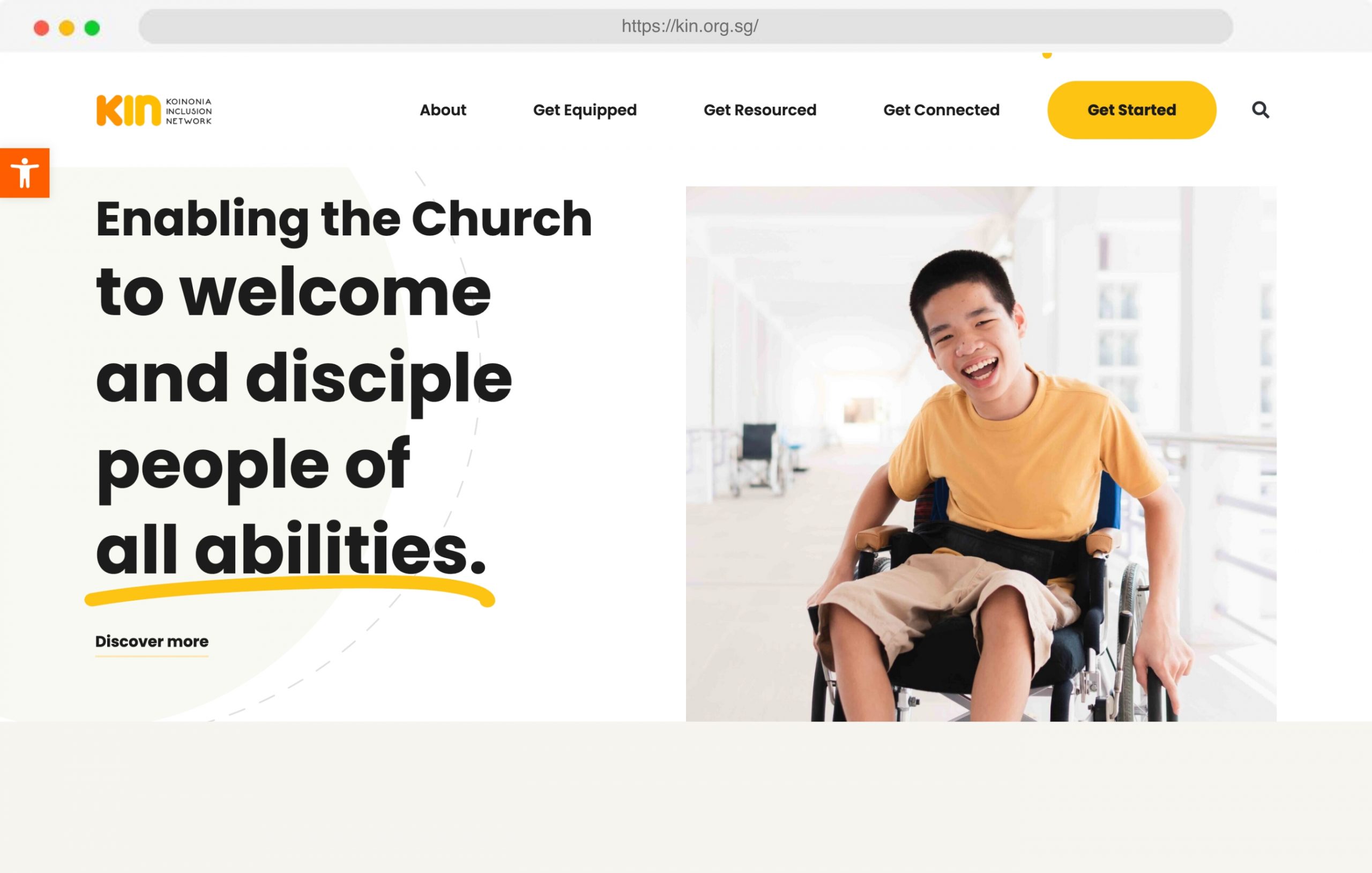
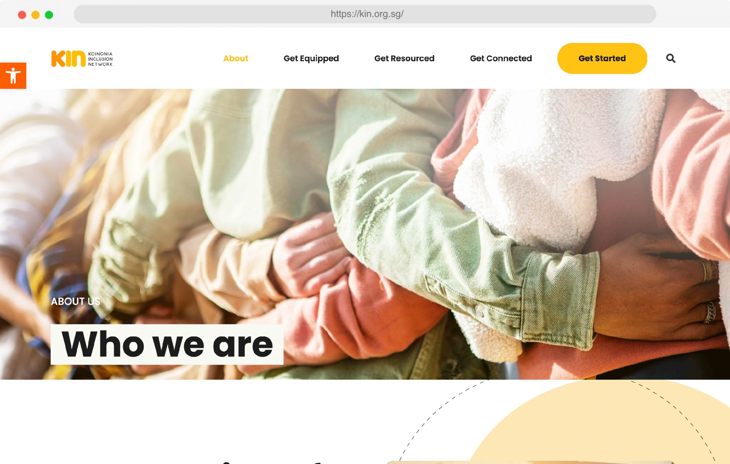
KIN needed to improve and reorganise their website’s structure so that information can be found easily. Having a good website architecture can help increase user exploration of the website’s content and increase user satisfaction. To kick off KIN’s website revamp, they came to us with a clear and concise plan on what they wanted for their refreshed site, which gave us more time to work on development to meet the tight deadlines. To reduce unnecessary clicks which might impair a user’s journey, we recommended limiting the pages to 5 main menu links, while sub-menu items became anchor links. This allows for a more fluid and natural content exploration, along with ease of navigation.

QUALITY ASSURANCE AND WEBSITE HOSTING
To ensure that KIN’s website is ready for viewing, our Quality Assurance process checks against a range of browsers and devices to reduce errors. In addition, KIN’s prior hosting server was insufficient to host the new amount of content needed, so they decided to host with us, which increased their website speed under a more stable hosting server. If you would like to decrease long-loading page speeds, do drop us a message here and we will be glad to help.

We’re really into interactivity
Quizzes, animated elements, scrolling effects — we can do it all!


